scRNA-Seq Tutorial
Last updated: Feb 20, 2026I. Introduction
Single-cell RNA sequencing allows researchers to profile the gene expression of individual cells within a heterogeneous sample, such as a tissue or tumor.
Bulk sequencing was useful for characterizing the overall gene expression or DNA variation in a sample, but it couldn’t reveal the diversity and functional differences among individual cells within that population.
Tang et al 2009 introduced a technique of microfluidics to isolate single cells and perform RNA sequencing on them.
Thereafter Numerous SCS methods were developed, including scDNA-
seq, scATAC-seq, scMethyl-seq, Smart-seq2, and 10× Genomics. These methods expanded the scope of single-cell analysis beyond transcriptomics, into genomics, epigenomics, etc.
Feature = gene
Barcode = cell
Count Matrix : From Raw Counts to UMIs
In bulk rna seq the count matrix obtained by running feature counts on the FaSTQ output of the bulk sequencer contains count values which signify both the unique number of mRNA molecules in the sample plus the number of PCR duplicates, and because we have enough number of cells, the proportion of PCR duplicates is usually not too high. When you use DESeq2 on bulk data, it uses a Size Factor normalization it somewhat tries to reduce this PCR noise effect.
In Single cell RNA seq on the other hand we have limited number of cells which demands greater no. of PCR cycles before the sequencer can detect it. which is why sometimes the number of PCR duplicates can far exceed the number of unique molecules (PCR bias). Therefore, unique molecule identifier or UMI are attached at the library preparation stage by CellRanger in SCRNA seq which eliminates The contribution of PCR duplicates in the count matrix.
Single cell RNA-seq data may be generated using the Cell Ranger (10X genomics) platform which contains two types of (raw & filtered) feature-barcode matrices. Each element of the matrix is the number of UMIs associated with a feature (row) and a barcode (column).
Note on Multi-Sample Data: If your dataset is a merger of multiple samples (e.g., different conditions, mice, or batches, stored in orig.ident), batch effects can dominate the analysis. So a modified workflow incorporating Harmony for batch correction, making it universal for both single-sample (e.g., PBMC) and multi-sample data (e.g., MC38 tumor models) will then be needed.
II. First steps
Step 1: Loading Packages
Load necessary packages, including Harmony for batch integration.
library(dplyr)
library(Seurat)
library(patchwork)
library(openxlsx)
library(writexl)
library(tidyverse)
library(ggplot2)
library(harmony)
Step 1 : Reading Data
We start by reading in the data. The Read10X() function reads in the output of the cellranger pipeline from 10X, returning a UMI count matrix
pbmc.data = Read10X(data.dir = "filtered_gene_bc_matrices/hg19/")
Step 2 : Create Seurat Object
First we need to understand the structure of a seurat object.
pbmc (Seurat object)
│
├── assays
│     ├── RNA
│     │     ├── counts
│     │     ├── data
│     │     └── scale.data
│     │
│     └── SCT (if present)
│
├── meta.data
│
├── reductions
│     ├── pca
│     ├── umap
│     └── tsne
│
├── graphs
│     ├── RNA_snn (used by FindClusters())
│     └── RNA_nn
│
├── active.ident
│
└── misc
You can check them by running : slotNames(pbmc)
You can run GetAssayData(...) to extract a specific assay.
Ok let’s start by converting the UMI count matrix from the last step to create a Seurat object.
pbmc = CreateSeuratObject(counts = pbmc.data, min.cells = 3, min.features = 200)
Genes detected in fewer than 3 cells are removed, and cells with fewer than 200 genes are removed.
This results in a Seurat object pbmc with approximately 22000+ features across 10,000+ cells.
Refer here to understand more about the structure of Seurat objects.
Basically its a nested structure like object @ slot @ assay @ layer.
The layer is the end dataframe you work on.
After creating your Seurat object, the next steps are data preprocessing, batch integration (if applicable) and dimensionality reduction.
III. Data Preprocessing
Step 1 : QC (Data cleaning)
- Calculate percentage of mitochondrial genes
pbmc[["percent.mt"]] <- PercentageFeatureSet(pbmc, pattern = "^MT-") - Visualize QC metrics in violin plot to decide thresholds
VlnPlot(pbmc, features = c("nFeature_RNA", "nCount_RNA", "percent.mt"), ncol = 3) - FeatureScatter used to visualize feature-feature relationships
plot1 = FeatureScatter(pbmc, feature1 = "nCount_RNA", feature2 = "percent.mt") plot2 = FeatureScatter(pbmc, feature1 = "nCount_RNA", feature2 = "nFeature_RNA") plot1 plot2 - Filter cells based on decided thresholds (adjust based on your violin plots)
pbmc <- subset(pbmc, subset = nFeature_RNA > 200 & nFeature_RNA < 2500 & percent.mt < 5)
Step 2 : Data Normalisation
This step addresses differences between cells by adjusting for sequencing depth or other technical variations, ensuring that gene expression values are comparable across cells.
After removing unwanted cells from the dataset, the next question we ask is: If Gene X has 10 UMIs in Cell A and 100 UMIs in Cell B, is Gene X expressed 10x higher in Cell B? Though we eliminated PCR bias by starting with “UMI” based count matrices instead of the raw counts, a sequencing-depth bias remains as follows : What if Cell B was just sequenced deeper (captured more mRNA molecules overall) ?
To fix this, the next step is to normalize the data. Here, to fix the sequencing depth bias, we normalise each UMI count by dividing by the sum of UMI counts for a particular cell, and then multiplying this by a scale factor (10,000 by default)
But even after normalisation it is observed that the normalised counts within a cell are highly skewed (right-skewed infact). So to make those values closer, we do “log” on the values, which compresses the dynamic range so highly expressed genes don’t dominate numerically (log turns multiplicative changes into additive ones, reduces skewness). This complete log-normalisation is done by the following command:
pbmc = NormalizeData(pbmc)
Normalized values are stored in pbmc[[“RNA”]]@data.
Eliminating Housekeeping Genes
Most genes in a cell are “housekeeping genes” (like GAPDH or ACTB). They are characterised by a near uniform expression across almost all cells.
The vst (variance-stabilizing transformation) method looks for genes that have high variance relative to their mean expression level. We can then eliminate those by keeping just the top 2000 most variable genes.
pbmc = FindVariableFeatures(pbmc, selection.method = "vst", nfeatures = 2000)

# Peek at the top 10
head(VariableFeatures(pbmc), 10)

# Plot variable features with and without labels
plot1 <- VariableFeaturePlot(pbmc)
plot2 <- LabelPoints(plot = plot1, points = top10, repel = TRUE)
plot1 + plot2
The low-variance genes (black dots in the above plot) are automatically eliminated by the FindVariableFeatures() function.
Step 3 : Scaling
This step addresses differences between genes by adjusting for varying ranges in expression levels across genes, making sure that no single gene with very high expression dominates the analysis.
Our goal is PCA clustering.
But even after log-normalising the counts, PCA would still be heavily driven by the most highly expressed genes, because their numerical variation is larger in absolute terms.
So now instead of focussing on the entire cohort of genes in a cell (as in the log-norm step), we will work these successive steps on each gene separately across all cells:
- Subtract the mean expression of that gene → centers to mean = 0
- Divide by the standard deviation of that gene → scales to variance = 1 (z-score transformation)
This process is called scaling. With this, every gene now has mean = 0 and variance = 1 across cells. Moreover a 2-fold change in a lowly expressed gene (e.g., from 0.1 → 0.2) becomes mathematically as “large” as a 2-fold change in a highly expressed gene (e.g., from 5 → 10). Also no gene dominates downstream math just because its raw/log values were larger.
all.genes = rownames(pbmc)
pbmc = ScaleData(pbmc, features = all.genes)

# Sanity check
pbmc@assays$RNA@scale.data[1:20, 1:5]
NOTE :
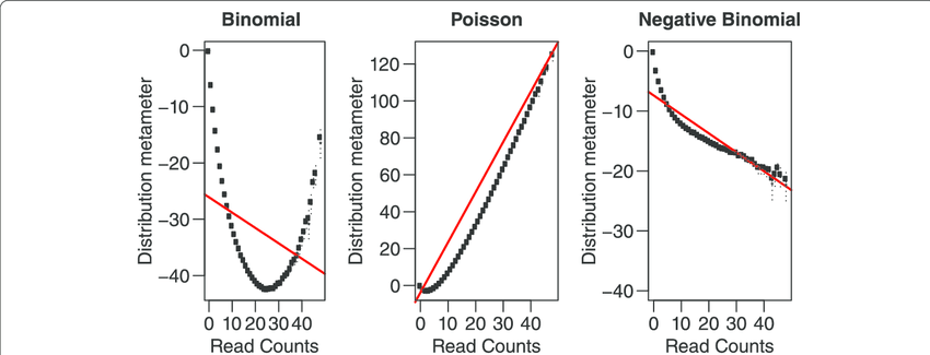
We can model scRNA-seq counts as a Negative Binomial (NB) distributed random variable. This captures overdispersion (variance > mean) in such count data which a Poisson distribution doesn’t. SCTransform method developed by Hafemeister & Satija (2019) uses this concept.
Here you can replace the NormalizeData -> FindVariableFeatures -> ScaleData steps with this single step:
pbmc <- SCTransform(pbmc, vars.to.regress = c("percent.mt"), verbose = FALSE)
IV. Dimensionality Reduction with Batch Integration
Step 1 : PCA
We’ve got the top 2000 high variance genes (HVGs) from the preceeding step, but 2000 is still a lot of dimensions. So we will try to reduce it to say 2 principal component axes
pbmc <- RunPCA(pbmc, features = VariableFeatures(object = pbmc))
This will print a summary of the top gene list in the +ve and -ve axes of each PC.
THEORY :
Suppose after HVG selection:
- 2000 genes
- 3000 cells
You now have a matrix:
\[X_{3000 \times 2000}\]PCA computes eigenvectors of covariance matrix:
\[\Sigma = \frac{1}{n} X^T X\]It finds directions:
\[\text{PC1} \to \text{direction of maximum variance}\] \[\text{PC2} \to \text{next orthogonal variance}\] \[\text{PC3} \to \text{next}\] \[\dots\]Each cell now becomes:
\[\text{Cell}_i = (\text{PC1}_i, \text{PC2}_i, \text{PC3}_i, \dots, \text{PC10}_i)\]Instead of:
\[\text{Cell}_i = (\text{Gene}_1, \text{Gene}_2, \dots, \text{Gene}_{2000})\]After running PCA, you can inspect the Cells × PCs matrix using :
Embeddings(pbmc, "pca")
# or
head(pbmc@reductions$pca@cell.embeddings)
Then to visually decide how many PCs to use for clustering run :
ElbowPlot(pbmc)
Step 2 : Batch Integration with Harmony (Universal for Single or Multi-Sample)
If your data has multiple batches (orig.ident), Harmony corrects for them. It works even for single-batch data (no change).
pbmc <- RunHarmony(pbmc, group.by.vars = "orig.ident")
# sanity check
head(pbmc@reductions$harmony@cell.embeddings)
The RunHarmony() embeddings values are actually quite close to the RunPCA() embeddings values.
V. Clustering
Step 1 :
Suppose from the elbow plot, you decide you’ll go ahead with first 10 PCs.
Let $ PC_{ik} $ denote the k-th principal component value of cell i.
Then, treating each cell as a point in 10-dimensional space, the Euclidean distance between 2 cells i and j will be
\[d_{ij} = \sqrt{\sum_{k=1}^{10} (PC_{ik} - PC_{jk})^2}\]Using this formula, for each cell, Seurat can find the its K nearest neighbors (default k = 20). This data is stored internally in pbmc@graphs$RNA_nn and is called the KNN graph. The edge weights of these k neighbours should then be normalised to create the SNN graph stored in pbmc@graphs$RNA_snn
. All of this is done using the single function FindNeighbours()
pbmc <- FindNeighbors(pbmc, reduction = "harmony", dims = 1:10) # Use "pca" if no Harmony or just skip "reduction" parameter
Step 2 :
With ther above SNN graph, we need to group nodes (cells) into communities based on dense internal connections and sparse external connections. Then our clustering will be done. This is done using th FindClusters() function.
pbmc = FindClusters(pbmc, resolution = 0.5)
This function is essentially a “community detection” algorithm (like how Facebook suggests friends). If Cell A is neighbors with Cell B, and Cell B is neighbors with Cell C, the algorithm starts to see a neighbourhood (cluster). It essentially creates a new “cluster” column and assigns a cluster no. to each cell in the dataset.
The Louvain algorithm used by Seurat for the above clustering determines the number of clusters automatically based on your data’s structure and the resolution you set.
You can check the number of clusters made in your Seurat object using:
length(levels(pbmc))
The resulting cluster assignments are stored in the Idents(pbmc) slot of your object.
VI. Non-linear dimensionality reduction
We have the SNN graph (depicting clusters) now.
But the above clusters are still in the 10-dimensional space (because we chose PC_1 to PC_10). But humans can only visualize in 2D. So before you can see those clusters on a 2D map (DimPlot), you must run a non-linear dimensional reduction like UMAP or t-SNE to reduce embedding for each cell to 2 axes : UMAP_1 & UMAP_2. This calculates the coordinates needed for the Dimplot
# Calculate UMAP coordinates
pbmc <- RunUMAP(pbmc, reduction="harmony", dims = 1:10) # skip "reduction" parameter for single sample
Results stored in @reductions$umap@cell.embeddings
VII. UMAP Visualization of Clusters in 2D
DimPlot(pbmc, reduction = "umap", group.by = c("orig.ident", "seurat_clusters"), label = TRUE)
VIII. Marker identification
Identifying markers of each cluster relative to all other clusters
When the code runs pbmc.markers <- FindAllMarkers(pbmc, ...), it performs a differential expression analysis (typically a Wilcoxon Rank Sum test) for every gene. This test compares the expression of a gene in one cluster against its expression in all other clusters combined. It will generate a large output pbmc.markers and takes a good amount of time and RAM.
pbmc.markers = FindAllMarkers(pbmc, only.pos = TRUE, min.pct = 0.25, logfc.threshold = 0.25)

# Write results to file
write.csv(pbmc.markers, "results/pbmc_markers.csv", quote = F)
pbmc.markers dataframe contains cluster-wise list of marker genes and also the adj. p-value of each gene which is symbolic of its differential presence in given cluster w.r.t. all other clusters.
N.B. For multi-batch data, use FindConservedMarkers() instead of FindAllMarkers() to find markers consistent across batches.
IX. Assigning cell type identity to clusters
# Show the top 2 marker genes for every cluster
a = pbmc.markers %>% group_by(cluster) %>% top_n(n = 2, wt = avg_log2FC)
# Extract all entries in the "gene" column into a single vector "genes"
genes = a %>% pull(gene)
After you find these marker genes, you usually run a FeaturePlot() to see where those genes “light up” on your UMAP:
FeaturePlot(pbmc, features = genes[1:2], split.by = "orig.ident")
You can then manually figure the out cell-type pertaining to each cluster based on the marker genes, and assign them to the clusters as below :
# Assign cell type identities
pbmc <- RenameIdents(pbmc,
  "0" = "CD4_T", "1" = "CD8_T", "2" = "B_cell",
  "3" = "NK", "4" = "Monocyte", "5" = "Dendritic")
pbmc$cell_type <- Idents(pbmc)
pbmc <- RenameIdents(pbmc, ...): This function renames the current active identities (usually the “0”, “1”, “2” clusters generated by FindClusters) to human-readable names like “CD4_T” or “B_cell”.
pbmc$cell_type <- Idents(pbmc): This line saves those new cell type names into the object’s metadata under a new column called cell_type. This ensures the labels are permanently stored and can be easily retrieved for later plots (like DimPlot or FeaturePlot).
Then to visualize, run DimPlot(pbmc, reduction = "umap", label = TRUE) to see your labeled clusters on a UMAP.
X. Seurat object to Cellchat model
CellChat v2 quantitatively infers signaling networks using curated ligand-receptor (L-R) databases and pattern recognition.
Communication probability is based on the Law of Mass Action and is given by :
\(P_{i,j} \propto \mathrm{Average}(L_i) \times \mathrm{Average}(R_j)\)
We need only 2 aspects of the seurat object to create the cellchat model. They are :
pbmc@meta.data$cell_type. This is vector like.- The log-normalised UMI count matrix stored in
pbmc@assays$RNA@data. Its shape :genes x cells
So we take these 2 aspects within the createCellChat(…) function and create a cellChat object.
# Load required packages (assuming already done)
library(CellChat)
library(patchwork)   # optional, for combining plots later

# Your code so far:
data.input <- GetAssayData(pbmc, assay = "RNA", slot = "data")
meta <- data.frame(
  cell = colnames(pbmc),
  cell_type = pbmc$cell_type,   # or pbmc@meta.data$cell_type if not active ident
  stringsAsFactors = FALSE
)
cellchat <- createCellChat(object = data.input, meta = meta, group.by = "cell_type")

# Set the database (you already did this correctly for human)
CellChatDB <- CellChatDB.human
cellchat@DB <- CellChatDB
showDatabaseCategory(CellChatDB)
XI. Seurat preprocessing
We don’t want all genes. We only want:
- signaling genes
- Overexpressed genes
- Overexpressed interactions
So we subset accordingly.
We can also project our preprocessed data onto relevant PPI network for network smoothing.
# === Preprocessing for cell-cell communication analysis ===

# Subset the expression data to signaling genes only
cellchat <- subsetData(cellchat)

# Identify over-expressed genes in each cell group compared to others
cellchat <- identifyOverExpressedGenes(cellchat)

# Identify over-expressed interactions (ligand-receptor pairs)
cellchat <- identifyOverExpressedInteractions(cellchat)

# Optional: project gene expression onto a protein-protein interaction (PPI) network
cellchat <- projectData(cellchat, PPI.human)   # or PPI.mouse if applicable
XII. Communication Probability
We use TriMean between the two group expressions (to reduce outlier effects) to compute comm prob with a p-value. So statistically inference has been performed.
We then filter out those cells from the cellchat object where group size < 10 thus preventing rare cell types from dominating.
# === Core inference step: Compute communication probabilities ===

# Main function: calculate communication probability and permutation test p-values
cellchat <- computeCommunProb(cellchat,
                              type = "triMean",          # or "truncatedMean"
                              trim = 0.1,                # default trimming
                              population.size = FALSE)   # set TRUE if rare cell types dominate

# Filter out weak communications (very important!)
# min.cells: minimum number of cells required to keep a sender/receiver pair
cellchat <- filterCommunication(cellchat, min.cells = 10)
The cellchat object now contains the net slot at cellchat@net. This slot contains a graph stored as a weighted adjacency matrix.
In this matrix, for each ligand-receptor gene pair, we have a sub-graph having weighted edges between all cell type pairs.
So for e.g. if you have 30 cell types and 2000 ligand–receptor pairs, then the total edges computed are 30×30×2000=1.8 million. That’s extremely granular and hard to interpret biologically.
However if we can consolidate those 2000 ligand-receptor pairs into say 3 pathways (like TGFb, WNT or Notch pathways), then the graph size reduces to 30 x 30 x 3 and is store in the @netP slot. For that we run the below command next.
# === Infer pathway-level networks (very useful downstream) ===
cellchat <- computeCommunProbPathway(cellchat)
Next we want to focus on the communication between the cell types. In other words, just flatten along the 3 pathways so that it collapses the 3D array into a 2D summary matrix (30 x 30).
This is needed to get the aggregated bird’s eye view for e.g. some cell types acting as “hubs” or “super-senders” across dozens of different pathways. This way we get the total communication intensity between pathway pairs, which is the first thing most reviewers want to see in a paper (e.g., via a Circle Plot). So run this :
cellchat <- aggregateNet(cellchat)
XIII. Visualising comm between cell-types
Now we got the aggregate data as a network/graph.
Cell-based network is simply a topological diagram: a collection of nodes (cells) connected by edges (interactions). However, treating all cells equally in such a diagram is fundamentally flawed, as it fails to capture true biological dynamics.
So before plotting the cell-based network, we must weight cells in order of their importance.
Some cells express a lot of both ligand genes and receptor genes. These cells thus have many in-degree and out-degree edges. These cells are called hubs of the network. This is called Degree Centrality.
Certain cells lie between many cell or cluster pairs, like a bridge cell. This is called betwenness centrality.
Certain other cells are so closely located to many other cells that they can spread any information (e.g. stress signal) to many cells across the network. This is called closeness centrality.
Finally a cell is weighted as more important if it is connected to other highly important (high-degree) cells. That’s because connecting to a highly influential cell is biologically more impactful than connecting to a quiet, isolated cell. Eigenvector and PageRank metrics evaluate the quality of connections rather than just the sheer quantity.
Once the centrality measure of each cell in the network is calculated, the node size or color can be later scaled proportionately to the centrality value, making the critical biological nodes immediately and visually prominent to the observer.
So to calculate these centrality values, run :
# Compute network centrality measures
cellchat <- netAnalysis_computeCentrality(cellchat, slot.name = "netP")
WE can then plot the roles for the entire aggregated network or for a specific pathway :
# Visualize the dominant senders/receivers for the AGGREGATED network
netAnalysis_signalingRole_scatter(cellchat)

# Or visualize for a SPECIFIC pathway (e.g., TGFb)
netAnalysis_signalingRole_scatter(cellchat, signaling = "TGFb")